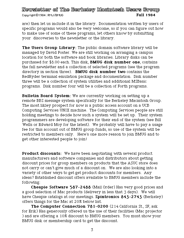
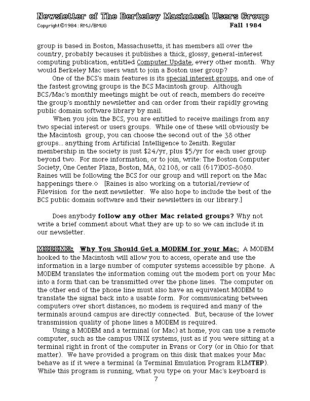
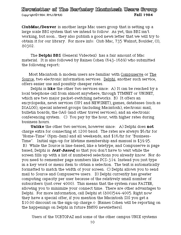
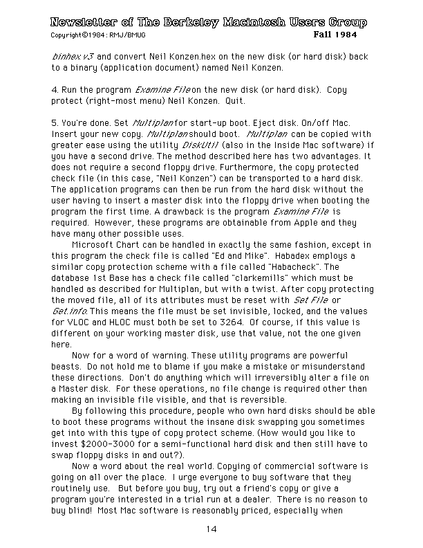
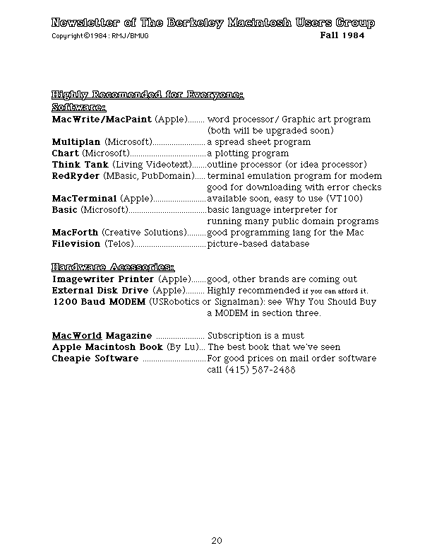
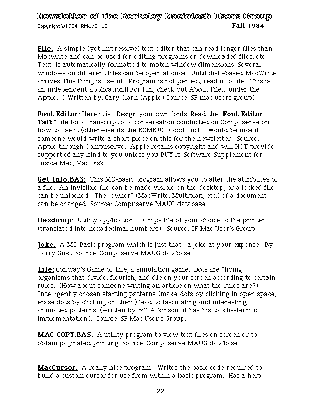
Thanks to a person who found an early CD-ROM from the Berkeley Macintosh Users Group, I was able to recover the first BMUG Newsletter and play around with few ways of preserving its original look and feel. Based on file creation dates, and contextual information in the text, this “Fall 1984” document was probably finalized in September. The contents are a fascinating look into the Macintosh fan culture at that time.
Although I’ve been collecting the physical BMUG Newsletters for a few years (each of which is several hundred pages), the very first edition of this series was electronic only: a series of MacWrite documents, split up to avoid the page limitations in that early software and in the first Macintosh’s 128k of RAM.

Although it’s possible to convert files written in MacWrite to modern formats (text, RTF) with a variety of converters, these won’t preserve the ‘look and feel’ of reading the document on a 72-dpi screen. Specifically, the MacWrite document used a variety of bitmapped screen fonts, many which were designed by Susan Kare. These typefaces capture a certain style and moment in the history of desktop publishing — converting them to Times New Roman on a high-DPI screen completely loses that.
To get closer to the right look, I wanted to create the equivalent of what the output of an ImageWriter I (the Mac’s dot-matrix printer) would have looked like. I created a custom emulator using minivmac with an artificially-large screen. (Essentially, a Mac Plus with an impossible Portrait Display.) It looked like this:

…and allowed me to view an entire page of the newsletter on the screen at the same time. Taking screen captures of all pages, and importing them into Photoshop en masse created a set of images that could then be cropped to eliminate everything except the WYSIWYG portion of the page. Finally, I re-created the original page margins by setting a Canvas Size of 8.5x11” at 72dpi.
I bulk-exported all the layers in the PSD document and configured Adobe Acrobat DC to not apply any lossy compression to the image. (The compression algorithms are optimized for modern, multi-bit color images and will wreak havoc on 1-bit monochrome files.) Then some final adjustments to prevent Acrobat’s Optical Character Recognition from trying to deskew the (perfectly straight) pages, and we end up with the images below.
There’s one final trick to reproducing these bitmapped images on today’s high-resolution displays: disabling image resizing algorithms. Modern web browsers must resize 72dpi images to twice their original dimensions to display properly on “Retina,” 4k, and other kinds of HiDPI displays. They use upscaling algorithms that are optimized for full-color JPEG photographs, which look great on those files but introduce fuzziness into monochrome pixel art. For this reason, each image below has the following CSS arguments applied, to force browsers to display them as crisply as possible:
image-rendering:optimizeSpeed;
image-rendering:-moz-crisp-edges;
image-rendering:-o-crisp-edges;
image-rendering:-webkit-optimize-contrast;
image-rendering:optimize-contrast;
image-rendering:crisp-edges;
image-rendering:pixelated;
-ms-interpolation-mode:nearest-neighbor;
If you’re viewing this page on a mobile phone, the PDF copy of all 24 pages will probably look best. But if you’re on a laptop or desktop computer, the individual pages at their original 72dpi are reproduced below:


