a blog by Peter Leonard


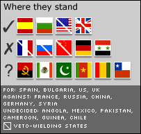 I know! The best way to visually represent a proportion is through dozens of miniscule, ill-proportioned flags! And let's draw a random white streak across some that have a "veto" attribute! Because nothing signifies "special importance" like thin diagonal effacement!
Too easy? Let's add microscopic, all-caps text below! Which makes no visual distinction between the category and the relevant nations. Better: We'll eschew indenting, to rob the text of even the most basic visual organization. Hah!
You can view the offending article here.
(Perhaps this is just a big PR move by the Comunidade dos PaÃses de LÃngua Portuguesa to increase public awareness of the flag of Angola.)